THEME DEVELOPMENT IN DESIGN
The theme of a yearbook is what ties the book together.
I remember sitting at MIPA camp during the summer of 2016, summer before my first school year being Editor-in-Chief, listening to the teacher of my session talk about theme. He told our class that if you rip all the pages out of several yearbooks, you should be able to put the yearbooks back together by the design on the pages. What he meant was, theme should be carried through out every page in a yearbook. Every single page should be unique to your book and relevant to your theme.
Since then, this idea has been nailed into my head. I work my hardest to make sure every page in our book is theme driven. Pages like, the dividers, endsheets, title page, and so on, are the best examples of this. As Editor-in-Chief I design these pages and I work my hardest to prominently display the theme through these spreads.
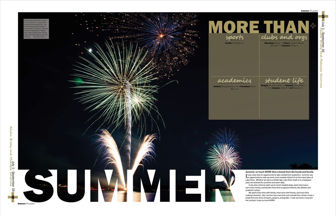
The dividers in a yearbook are essential to carrying out the theme through the book. Since the theme of the 2018 Dragon yearbook is "More Than a Dragon," the dividers incorporate design elements like the plus sign. The "More Than" phrase is used to show a table of contents, divided by topic, for that section, in the shape of a plus sign.
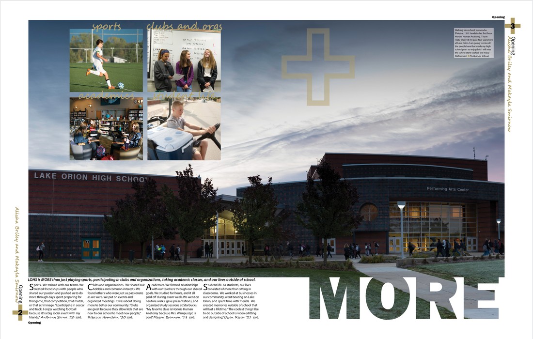
The dividers in a yearbook are essential to carrying out the theme through the book. Since the theme of the 2018 Dragon is "More Than a Dragon," the dividers incorporate design elements like plus signs, the word MORE, and the picture inside of words design. Also since the cover is an outline of our school, the school is incorporated here to carry that idea through more than the cover.
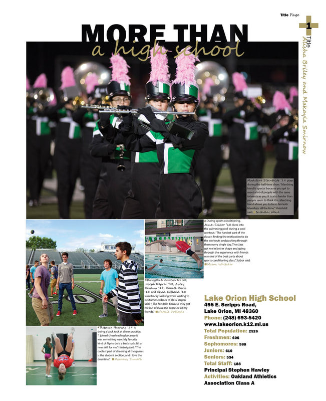
For the 2018 Dragon title page, design elements helps to continue the theme from the cover into the first page.
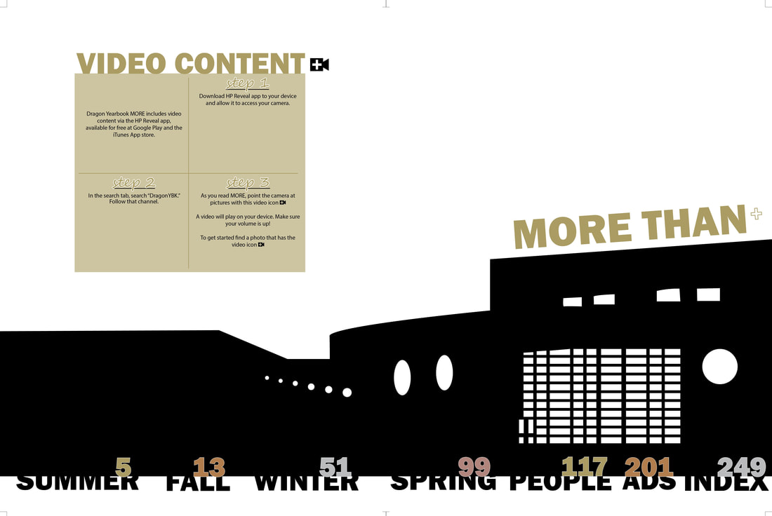
For the endsheet of the 2018 Dragon, the outline of our school is taken from the cover, as well as other design elements.
For the closing in the 2017 Dragon, design elements and the theme were carried on throughout the book all the way to the very last page of the book.
|
|
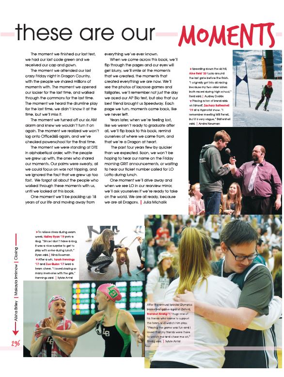
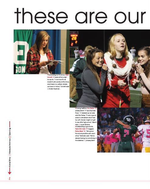
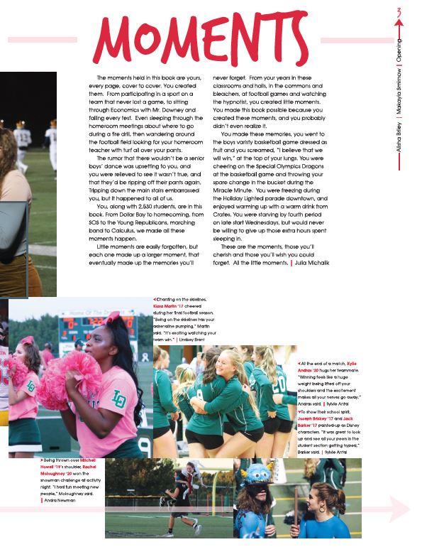
The opening introduces the theme of the 2017 Dragon. It is important to make the theme very prominent at the beginning so readers will keep that theme in mind when reading through the rest of the book.
|
|
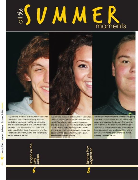
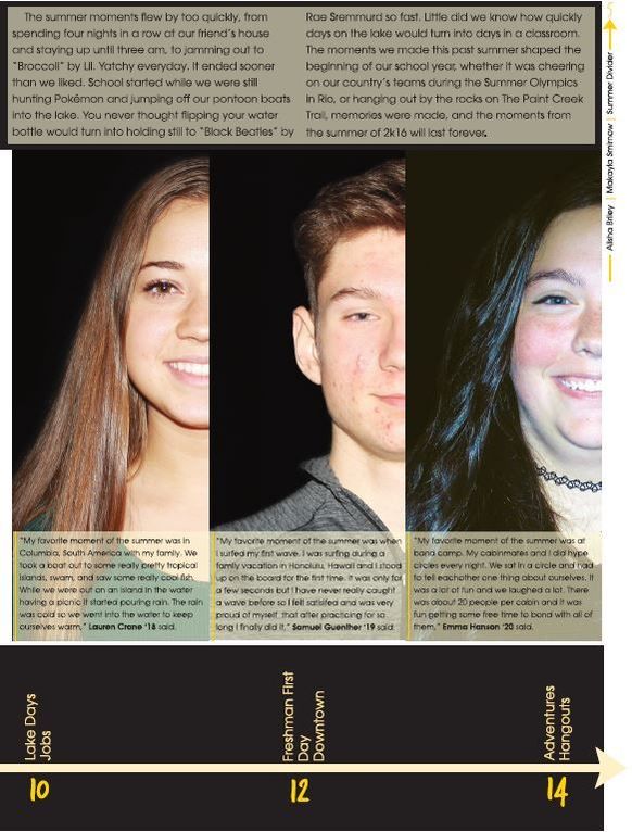
All the dividers in the 2017 Dragon used the design element of using half a person's face to show personality. This design helps to fit more people in the book. The table of contents at the bottom helps the reader to know what to look for in each section.
