DESIGN
Design is something I am very passionate for. It is the first thing I learned in yearbook class, and I like to think I caught on and developed a third eye for it quickly. I love starting with a blank spread and getting to use my creativity to do whatever I can imagine with the page. It is an outlet for my imagination with endless possibilities.
Every year we try to make our homecoming tip-in something unique and different than the years before. For the 2018 Dragon, we went with the waterfall pages design. The photo on the side is on every page in the tip-in, and when the pages are put all together in the book it makes one big photo.
|
|
For the colophon in the 2017 Dragon, I used the personality profile design (using half the person's face) that we used throughout the book, to show the staff members and their position on staff. This kept the design concept consistent and relevant until the very end of the book. This was tricky to organize by positions and fit in with the rest of the pages.
|
|
In the 2017 Dragon, for the charity week tip-in we went with a cut page, smaller than the rest of the pages, to make it stand out. This is a special week for our school and a lot of students look forward to looking at this tip-in, so it has to be unique. It was a challenge working with a different size page to stick with design elements and fit the large amount of events that happened during the week.
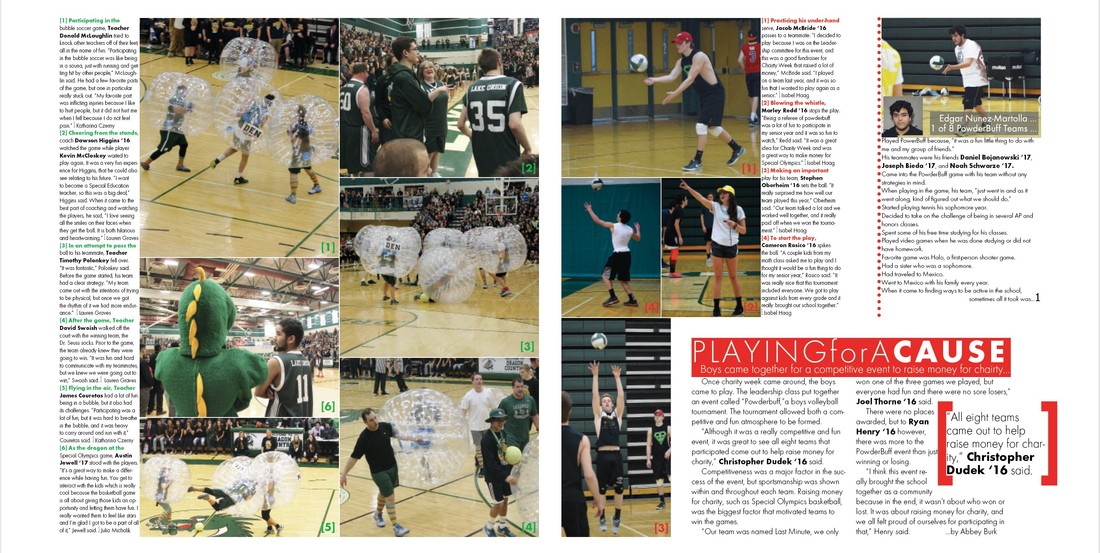
This is another page from the charity week tip-in from the previous year, the 2016 Dragon. This was again, cut to a smaller size and a difficult task to fit everything in on a smaller page.
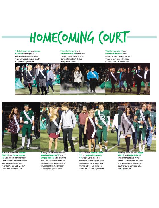
Displaying the homecoming court is always a struggle to design, and still follow design rules. In the 2017 Dragon, I decided to design it in this way to get in all the necessary coverage.
|
|
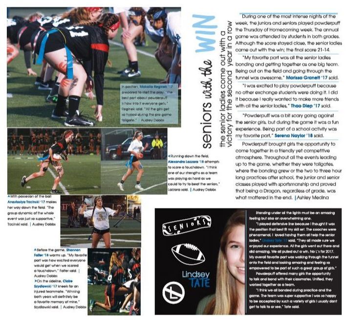
This is also another page of the 2017 Dragon homecoming week tip-in. Incorporating room for all the events during the week is the hardest part of designing these pages.
